I’d start by identifying your yellow’s specific tone—whether it’s pale Ivoire De Medici or warmer Sunrise Yellow—since this guides everything else.
Then, I’d pair it with brass hardware and soft gold finishes that echo mid-century charm.
Keep original tiles if they’re authentic, but replace damaged ones with exact matches.
Layer your lighting with mirror-backed sconces and adjustable LEDs around 3000K to 4000K.
Finally, refresh walls with complementary soft ivory or buttercream shades that mirror your tilework’s era.
There’s much more nuance to perfecting this look.
Identify Your Vintage Yellow Before Choosing Pairings
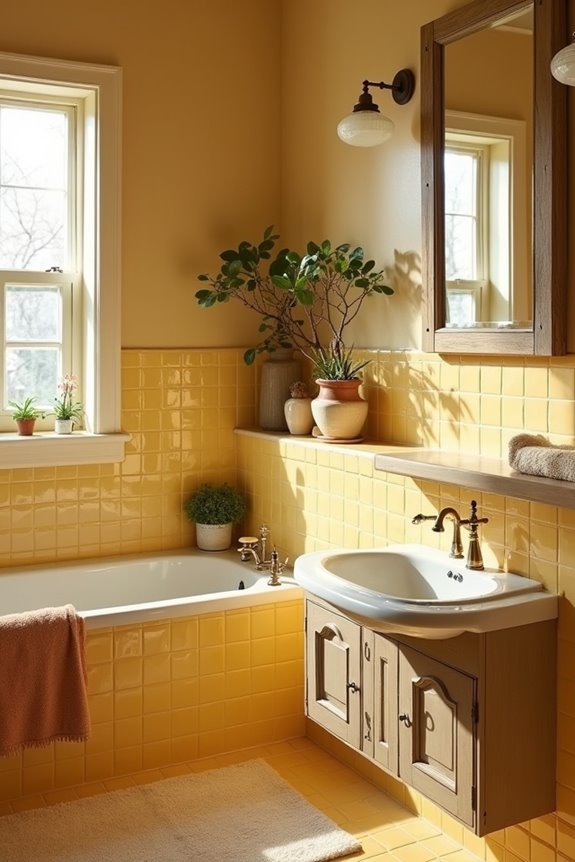
Why does your yellow tile look different from the ones in your neighbor’s bathroom? Your vintage yellow hues tell a unique story based on their catalog-era tones and era of production. I discovered that Kohler’s Ivoire De Medici reads as pale yellow, while Manchu Yellow appears brighter—these distinctions matter when coordinating fixtures. Tuscan and Sunrise Yellow span pale to beige-yellow ranges across decades, each carrying distinct green or warm undertones. I’ve learned to examine my tiles under natural light, comparing them against period catalogs. Understanding whether your yellow leans green or beige guides everything: which coordinating fixtures work best, what wall colors complement them, and how period-appropriate accessories enhance authenticity. This foundation makes decorating a deliberate process reflecting genuine vintage character.
Select Hardware That Honors Your Bathroom’s Original Era
Once you’ve identified your yellow tile’s unique undertones—whether it’s pale Ivoire De Medici or warm Sunrise Yellow—the hardware you choose becomes your chance to honor that original era. I’d recommend selecting brass or soft gold finishes that echo the mid century aesthetic your vintage bathroom deserves. Look for streamlined handles and valves with rounded or simple angular contours, avoiding chunky modern chrome that’d clash with your tile work. Smaller, elegant proportions matter here—think delicate towel bars and toilet paper holders that won’t overwhelm your space. When sourcing replacements, search using catalog-era terminology like Jonquil or Autumn Yellow to match your hardware with the vintage palette. This thoughtful approach creates a bathroom that celebrates its heritage and respects its original design intent.
Keep or Update Original Tiles Based on Authenticity
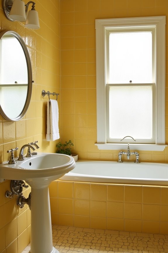
With your hardware selected to match your bathroom’s era, the tiles themselves become your next consideration—and honestly, this is where you’ll honor what makes your space special. If your original tiles display consistent mid-century yellow tones—think Kohler Old Ivory or Crane India Ivory—preserve them. These gems deserve to stay. Check against period catalogs to confirm authenticity; coordinating mint undertones signal genuine vintage pieces worth keeping. When damage appears, resist the urge to rip everything out. Instead, source exact color-match replacements or retro-reproduction tiles that blend seamlessly. Document your original patterns first: toe-kicks, mosaic textures, rough 1-square details. This groundwork maintains historical fidelity in any repairs. You’re not just updating; you’re protecting your bathroom’s story.
Light Your Vintage Yellow to Avoid Looking Dated
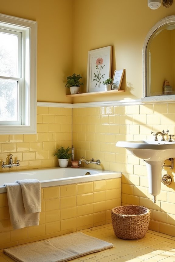
How do you keep those gorgeous yellow tiles from tipping into that tired, 1970s-bathroom territory? Lighting does the work. I’ve found that layering different light sources changes the entire vibe. Start with maximum natural daylight—think larger windows or skylights if possible. Then add mirror-backed sconces on either side of your vanity to amplify brightness and reduce that yellow saturation. Install adjustable LED bulbs (aim for 3000K-4000K color temperature) so you can dial in the perfect warmth without heaviness. Light-reflective surfaces like glossy tile trim and mirrored walls bounce illumination around the room, keeping everything fresh and airy. When you nail your lighting strategy, those yellow tiles stop feeling dated and start feeling intentionally charming instead.
Refresh Walls and Fixtures With Period Awareness
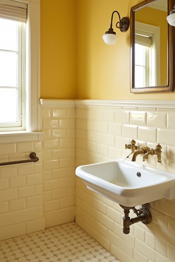
What really makes vintage yellow tile work well? Pairing it with walls in soft, period-appropriate colors like pale ivory or buttercup yellow. I’ve found that matching your walls to documented shades—think Ivoire De Medici or Manchu Yellow from 1930s–1960s American Standard catalogs—creates authentic harmony.
Your fixtures matter too. Choose warm-toned options like Ivory or Autumn Yellow to complement green-tinged or white tile accents common in Kohler and Crane palettes. This approach prevents clashing.
When refreshing, consider repainting walls in soft yellows within that 1927–1962 window to mirror your tilework directly. Avoid oversaturated hues that fight mosaic textures. Reference original era catalogs for shades like Citrus Yellow or Jonquil. Even small details count—matching toe-kicks in yellow-toned mosaics grounds everything together.